A bold brand identity system built to amplify RoadRunner’s impact across the outdoor gear space
RoadRunner Rifle Rest
B2C brand identity system
RoadRunner is a startup that builds compact gear for people who need stability and precision in unpredictable terrain. The company launched with a lightweight rifle rest that converts trekking poles into a steady shooting platform and later expanded into producing its own poles. The brand identity and visual system cover the logo, packaging and pre launch landing page.
-
Jennifer Wanderer, Art Director and Lead Brand Designer
Duncan Blake, Web Manager
https://roadrunnerriflerest.com/ -
RoadRunner creates gear for outdoor enthusiasts who need stability and precision in unpredictable environments. Their flagship product is the RoadRunner Rifle Rest, a compact stabilizer that converts trekking poles into a steady shooting platform. With the introduction of their own trekking pole, the brand needed an identity that could scale across multiple product surfaces, packaging formats and digital touchpoints while feeling technical, agile and durable.
-
Create a clear identity system that works across molded marks, compact packaging and a growing product line with a focus on function, clarity and outdoor utility.
-
The RoadRunner identity was developed as a cohesive system that balances technical precision with outdoor utility and scales across the rifle rest, trekking pole, packaging and the pre launch digital experience.
Identity and visual direction:
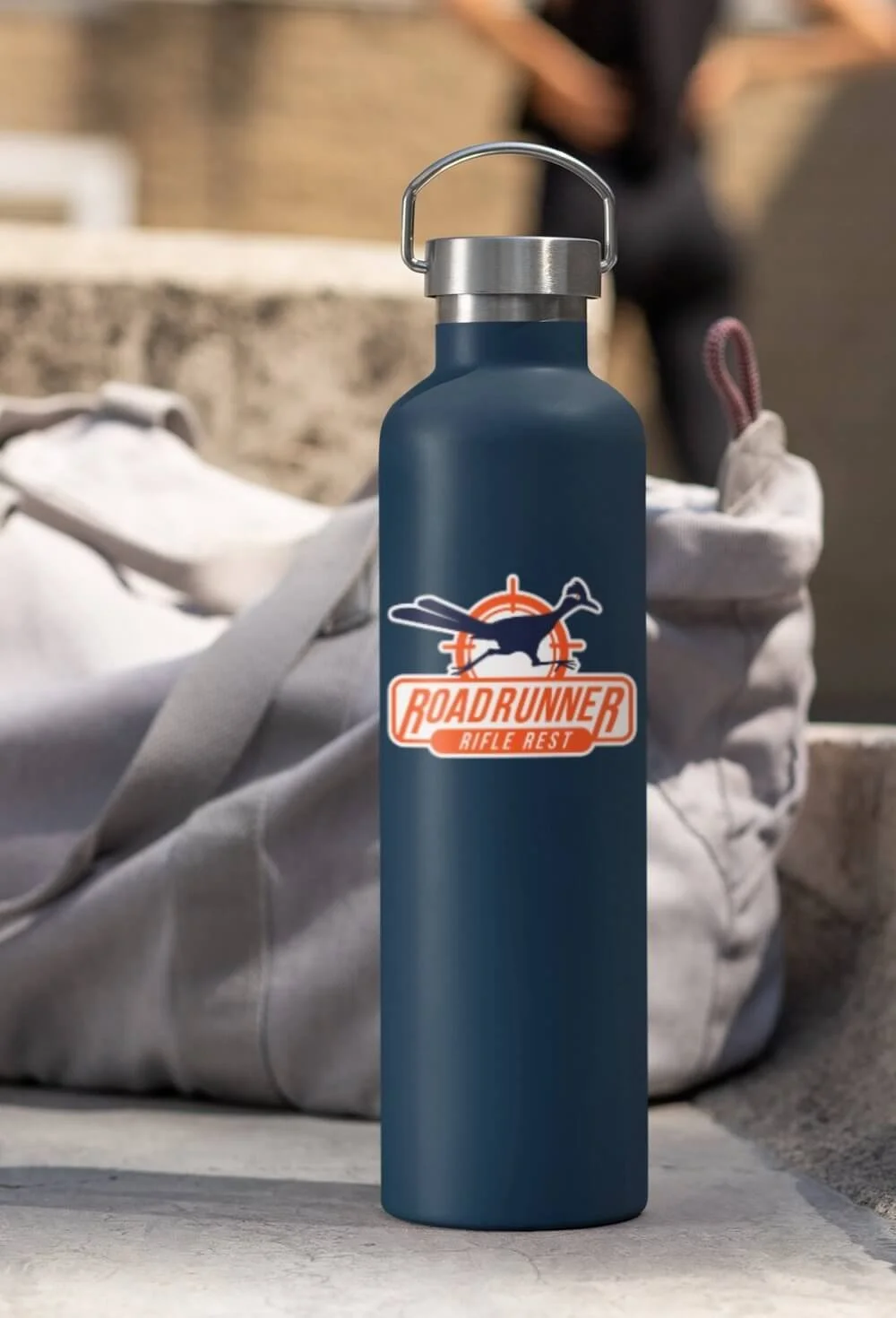
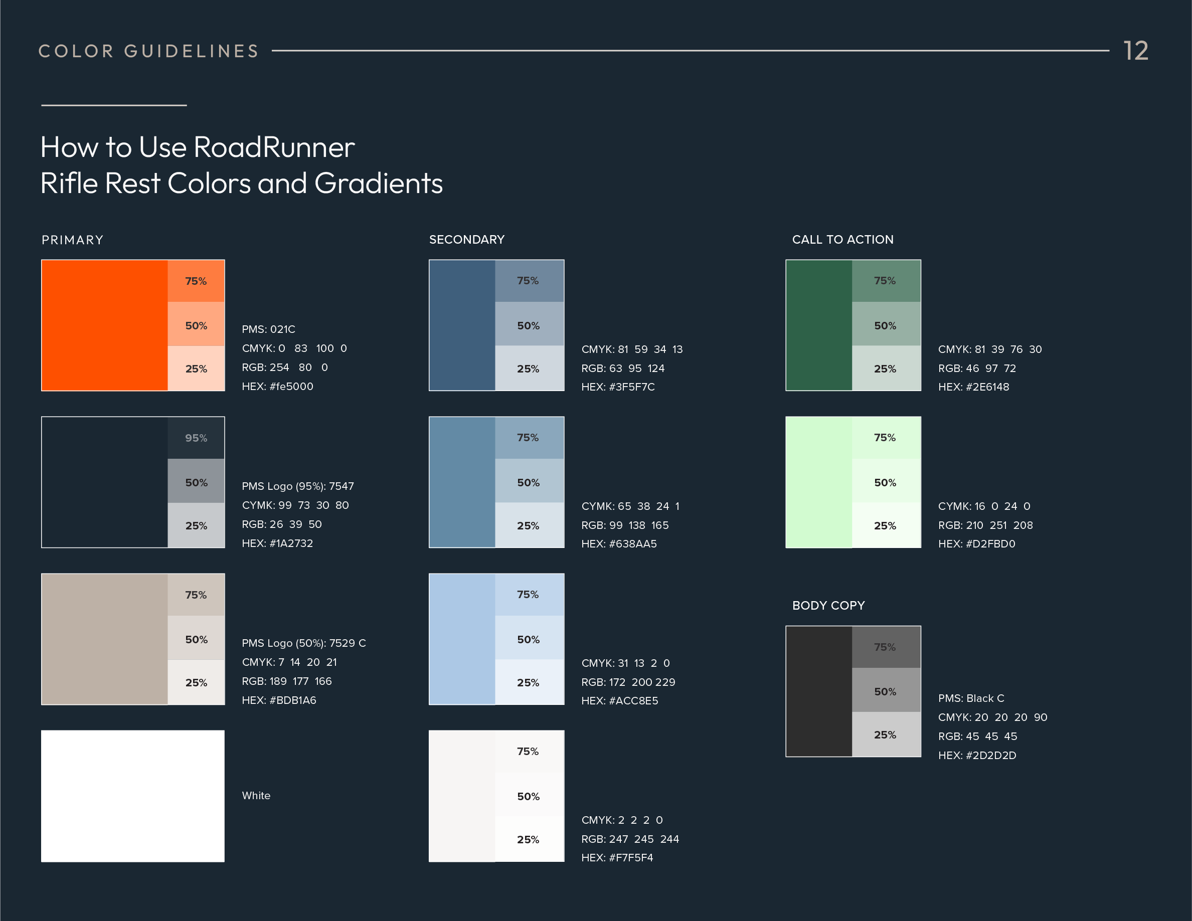
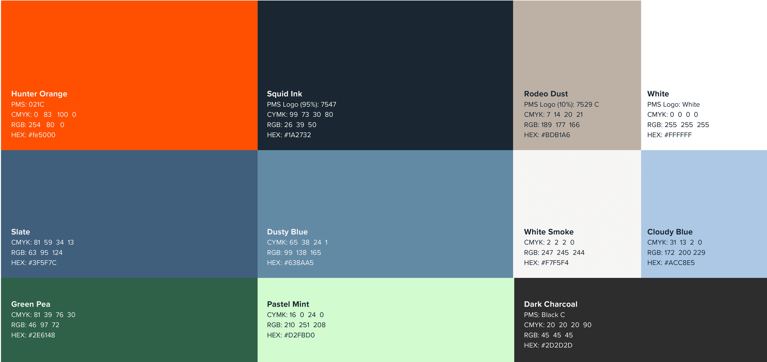
A bold palette built around hunter orange and navy was defined then tested across digital and print applications to ensure consistency and durability.Logo design:
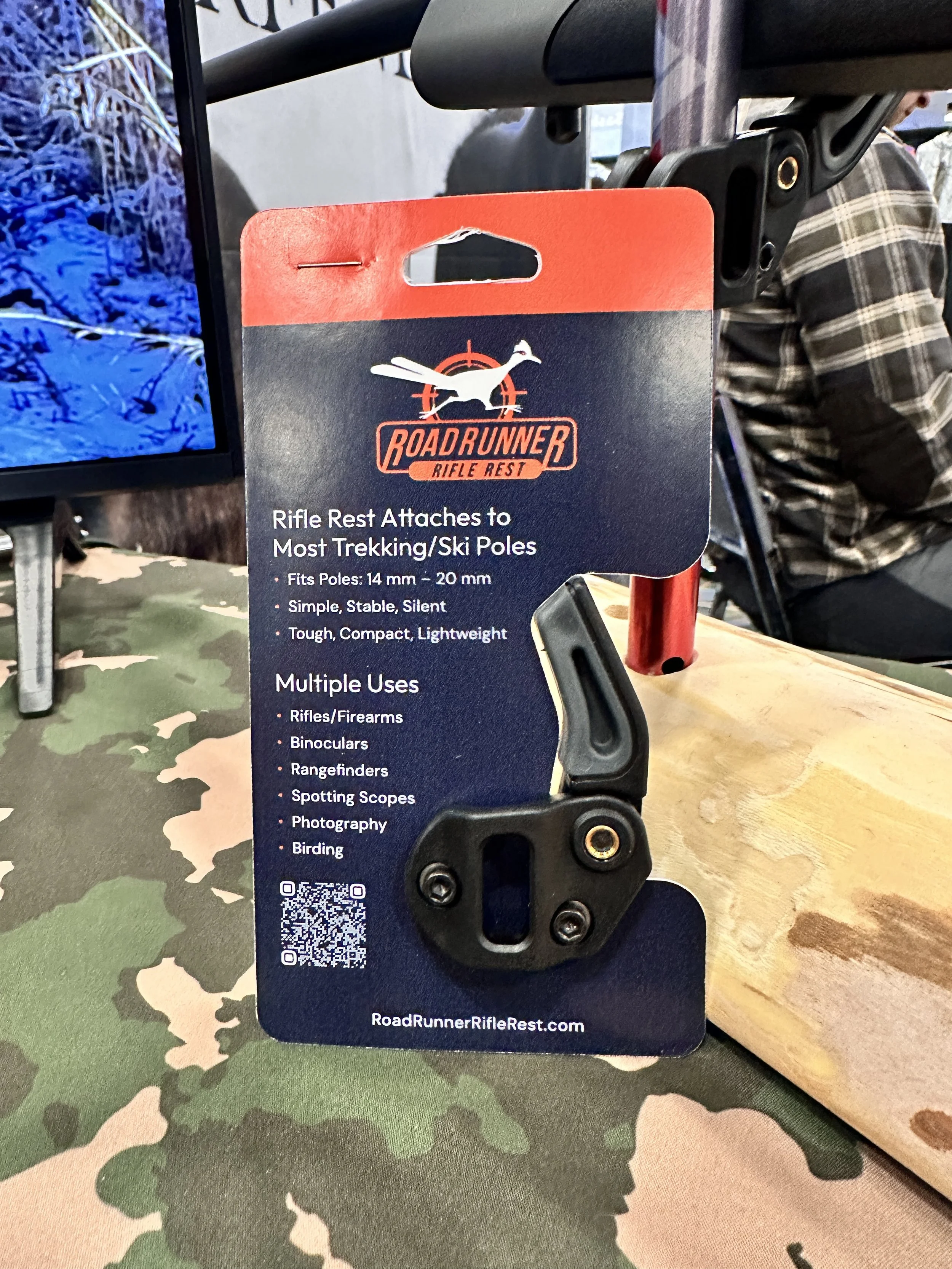
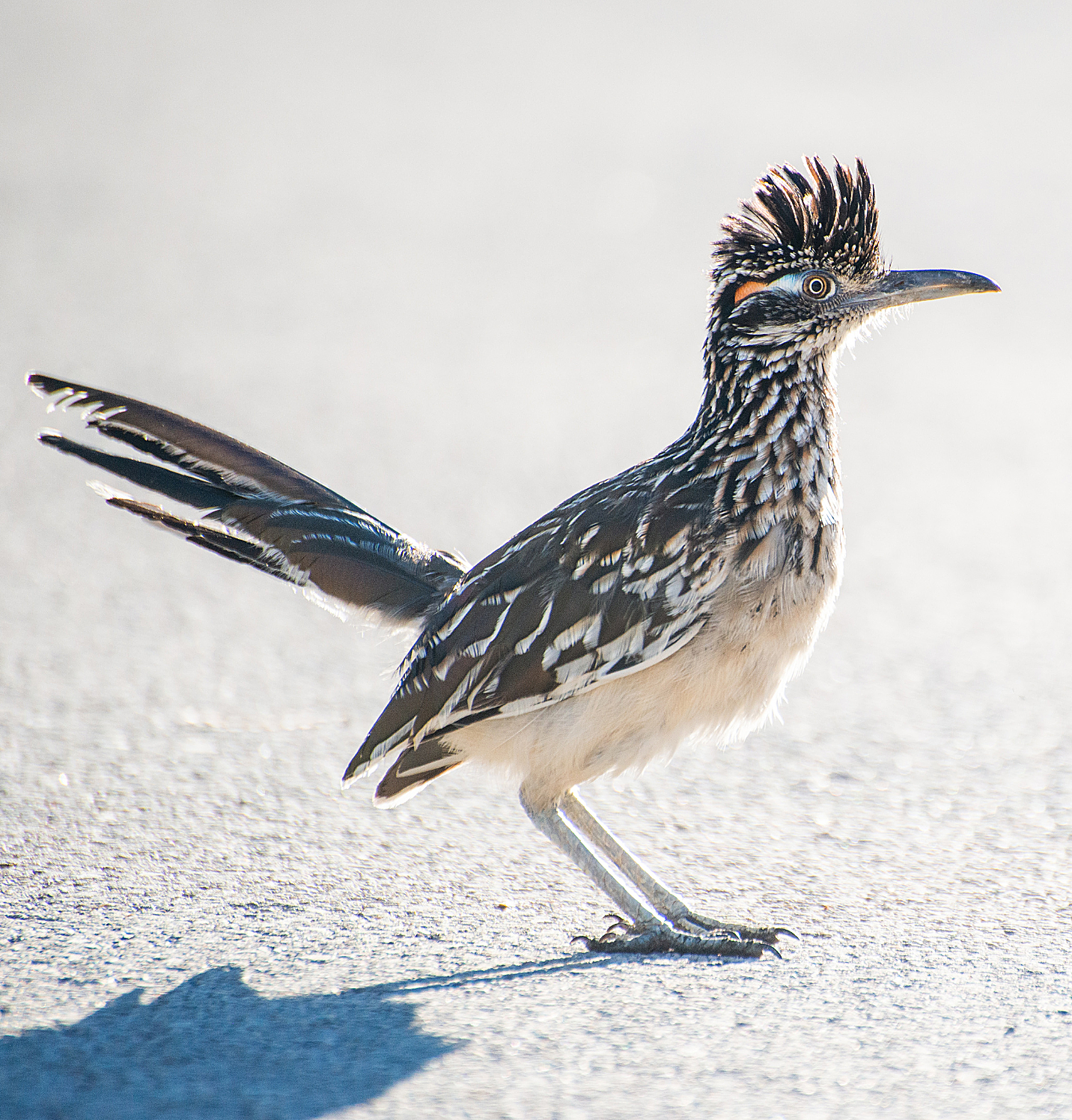
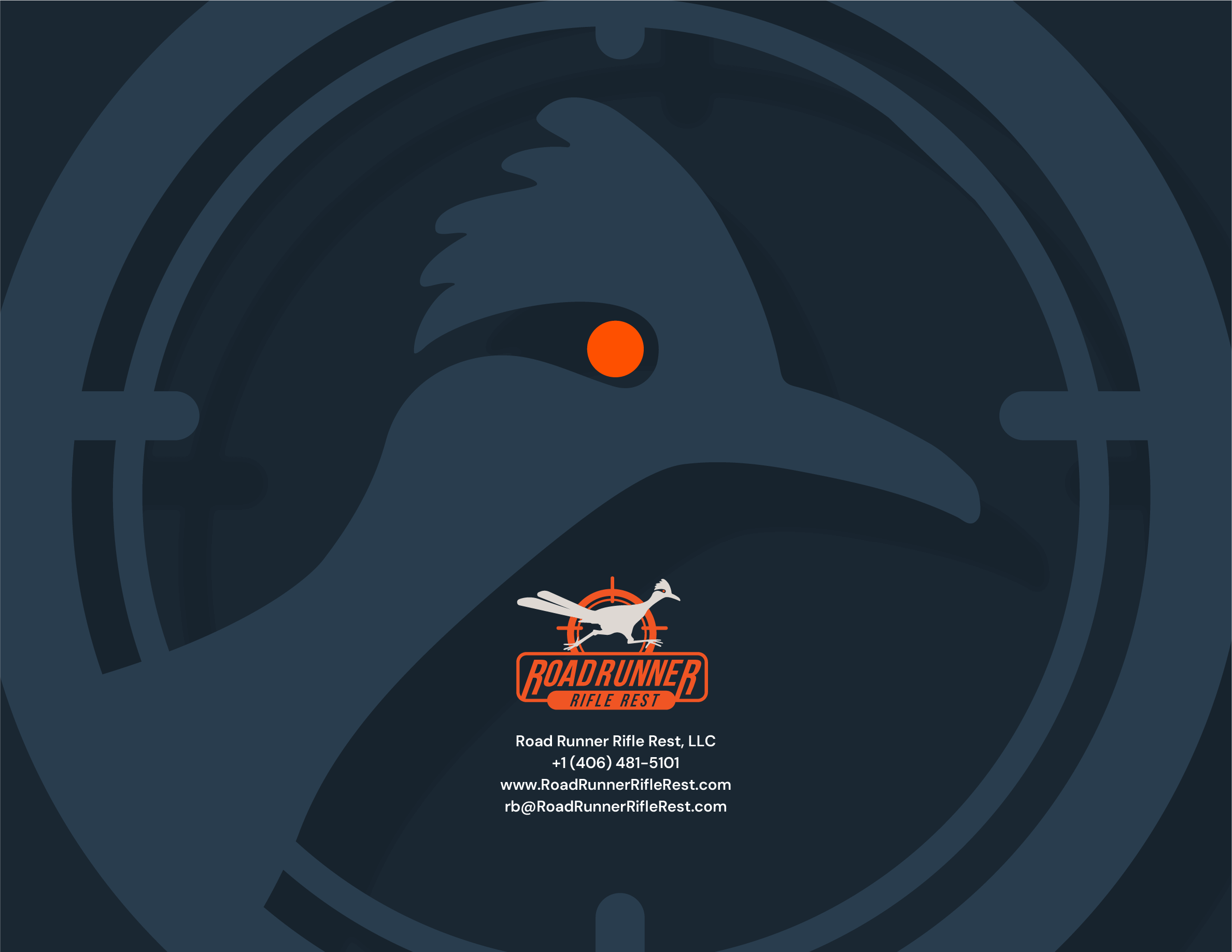
A roadrunner inspired mark was created to signal speed and accuracy then integrated into the product through a molded application for long term wear.Packaging design:
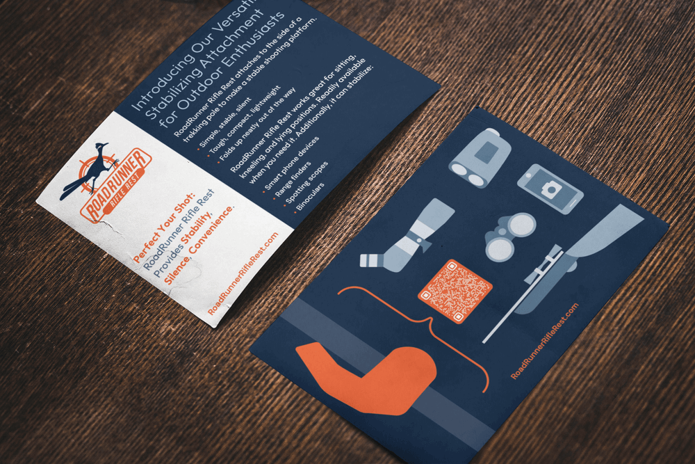
Compact packaging was designed with clear technical illustrations and a structured component layout to support ease of use and transport across both products.Identity and visual direction:
Established a bold color system using hunter orange and navy blue, tested across digital and print formats for consistency.Logo design:
Created a roadrunner-inspired mark that communicates speed and accuracy, then collaborated with engineering to mold the mark directly into the product for durability.Packaging design:
Developed compact packaging with technical illustrations and a clear component layout to support ease of use and transport across both the rifle rest and trekking pole. Product ecosystem alignment: Ensured the identity system flexed across multiple physical SKUs, including the brand’s trekking pole and maintained consistency across materials, finishes and form factors.Website launch wireframe:
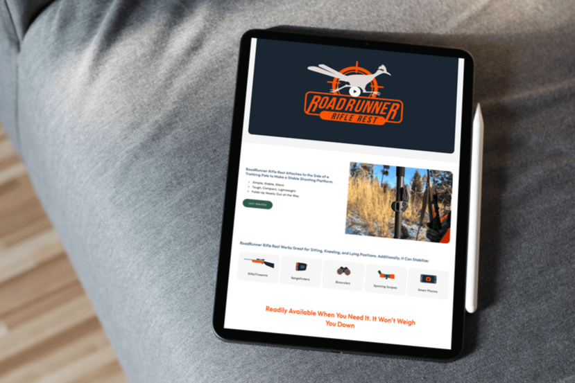
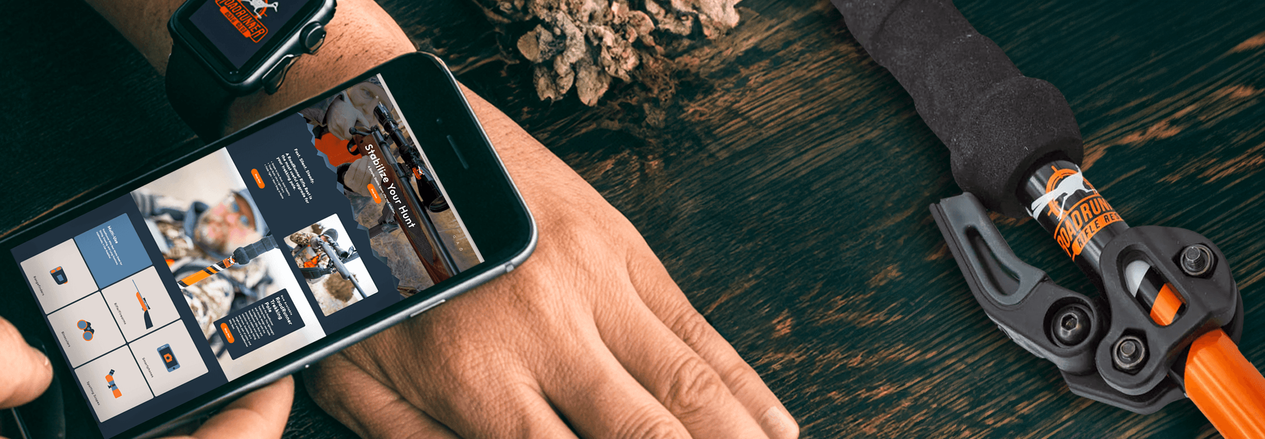
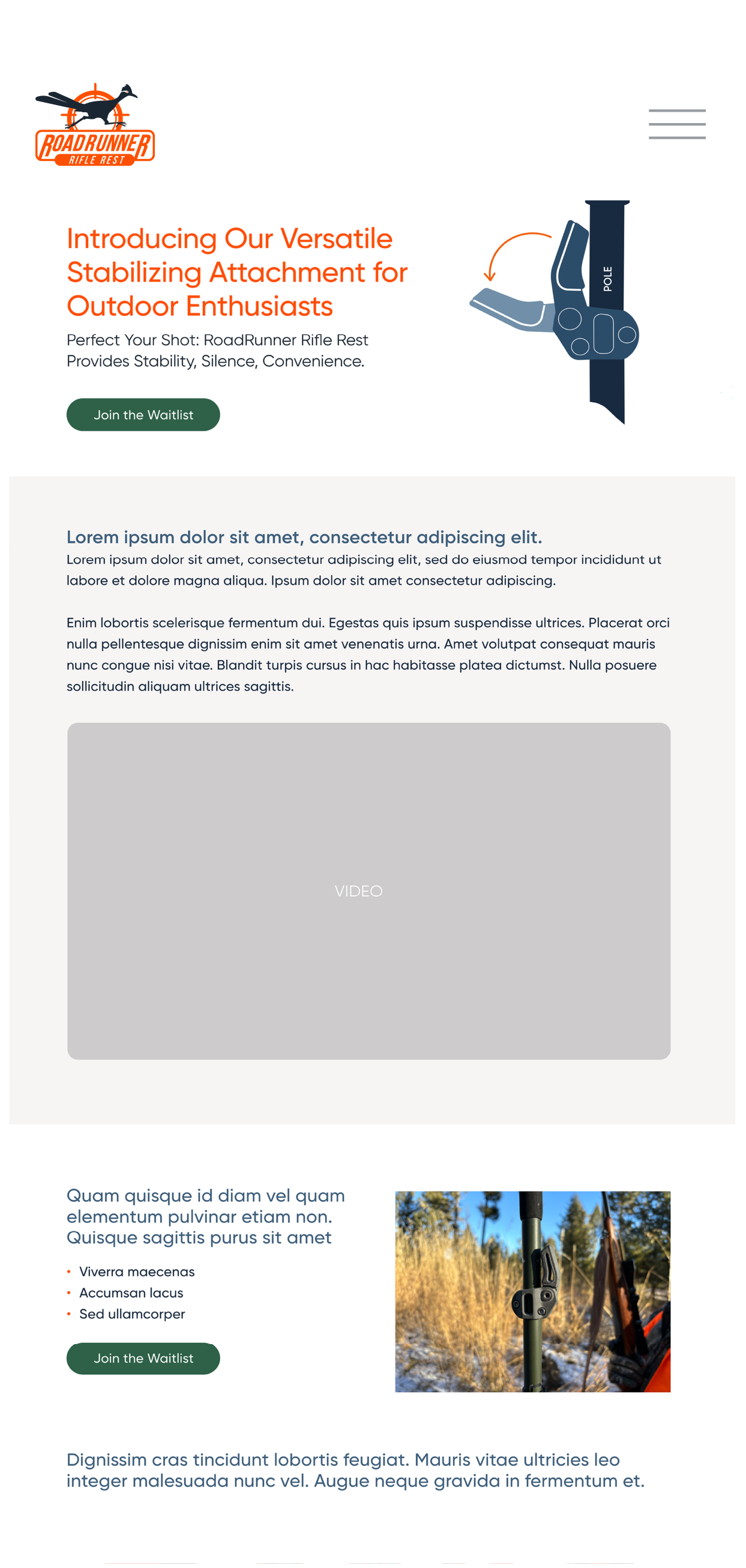
Built the pre-launch site structure and guided the parallax layout and integration of product video and photography for the June 2024 release.
Research
Identified a color space that differentiated the brand from the muted browns, greens and grays common in the hunting market.
Visual Exploration
A visual audit of the hunting market informed the color direction and early brand cues.
Mood Board
Established a palette that balanced vibrancy with natural tones to reflect energy and outdoor utility.


Logo discovery
Explored the roadrunner’s form to build a logo rooted in speed, precision and agility.


Font pairing
Paired Outfit.io with DM Sans to create a clear hierarchy that balanced bold headlines with clean, readable body text.
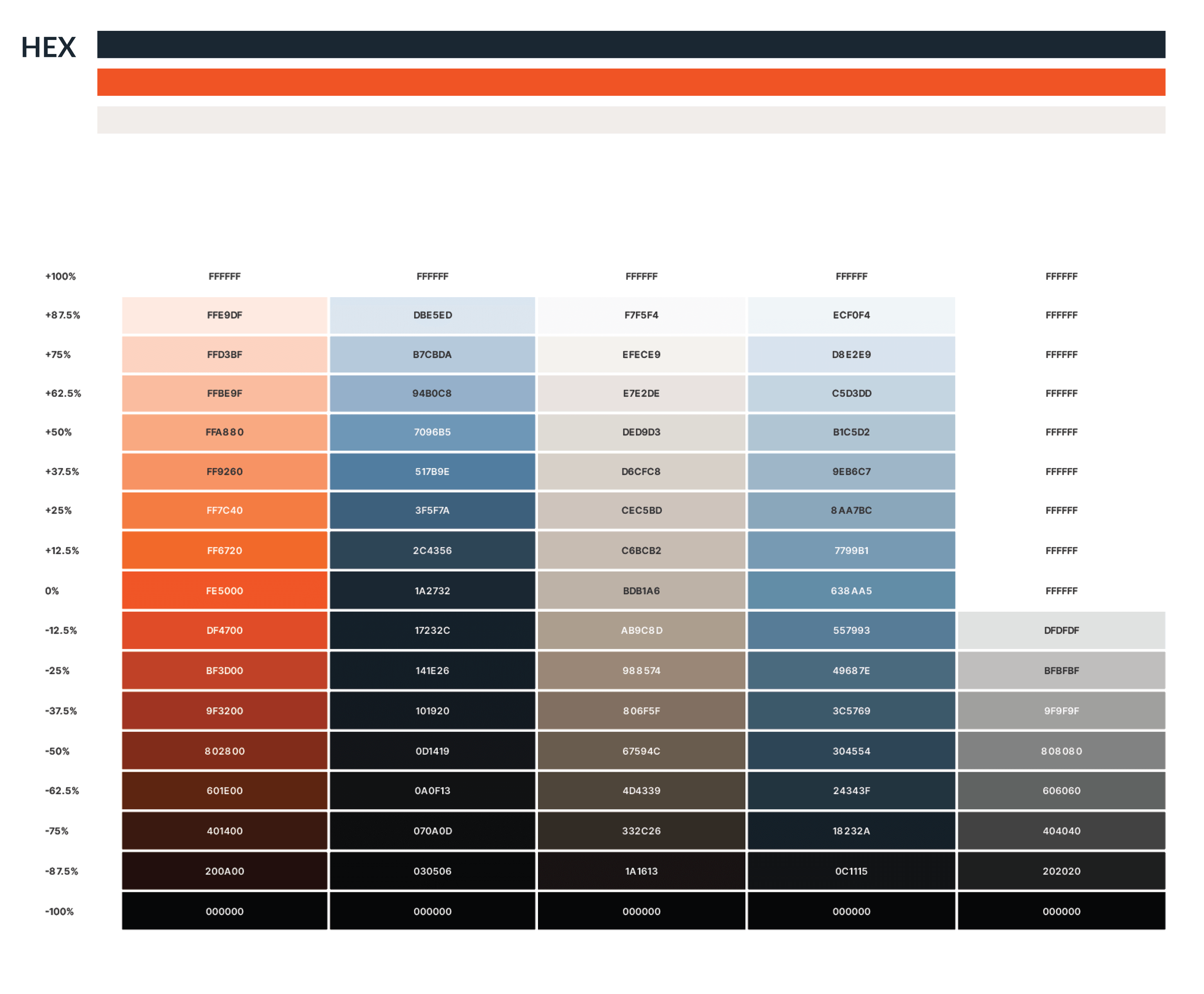
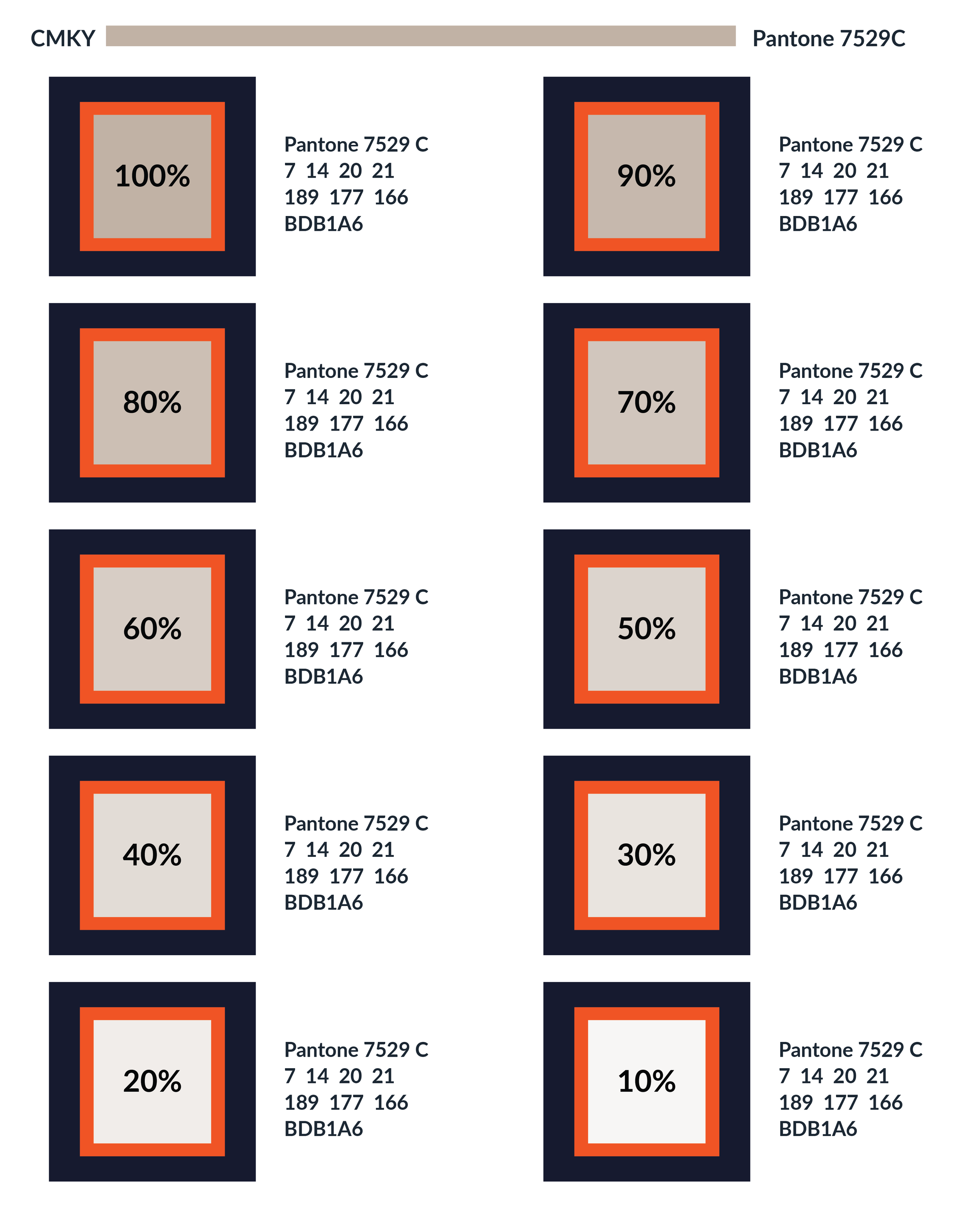
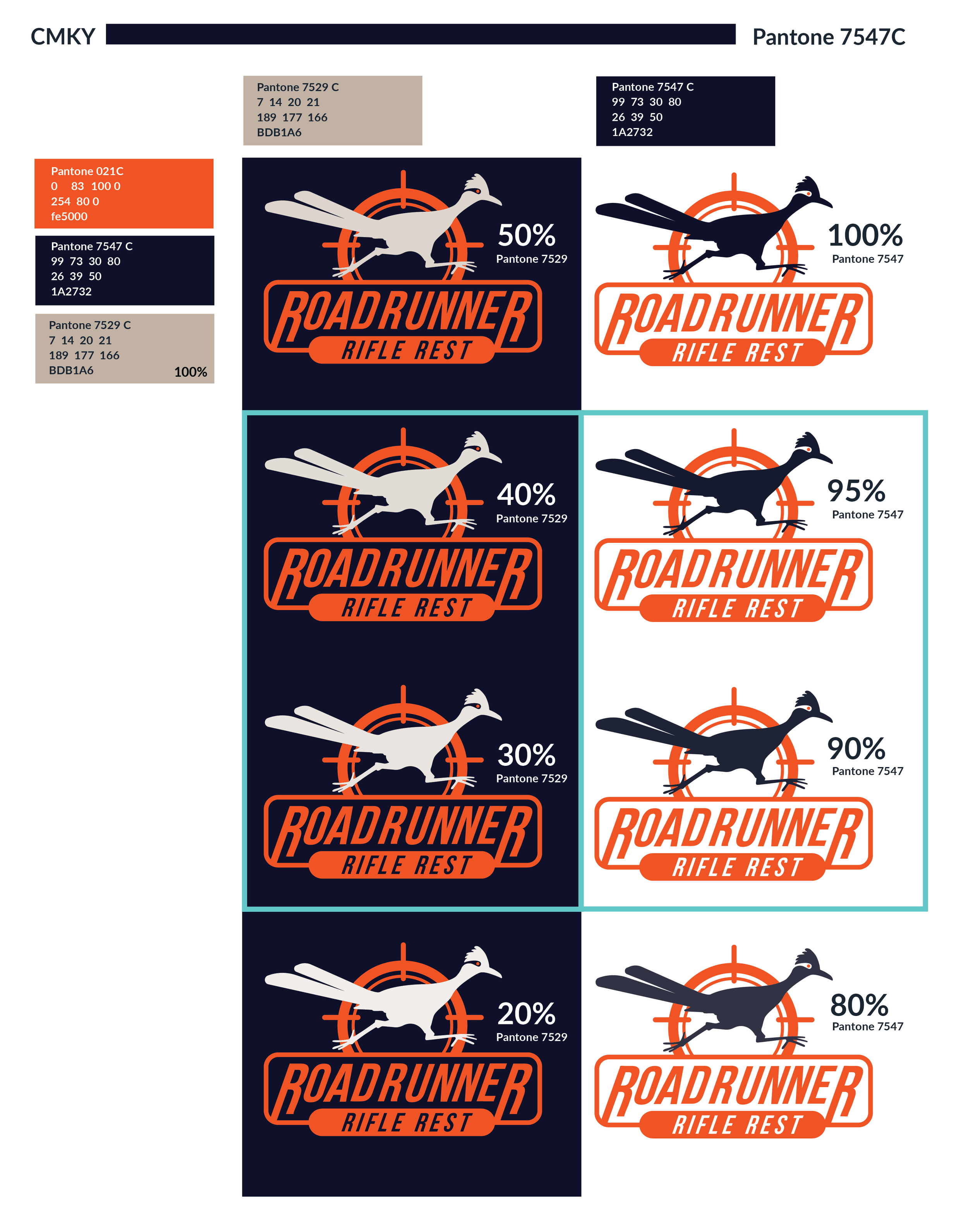
Brand colors
Refined hunter orange and navy through RGB and CMYK testing to ensure consistent and accurate color across digital and print.
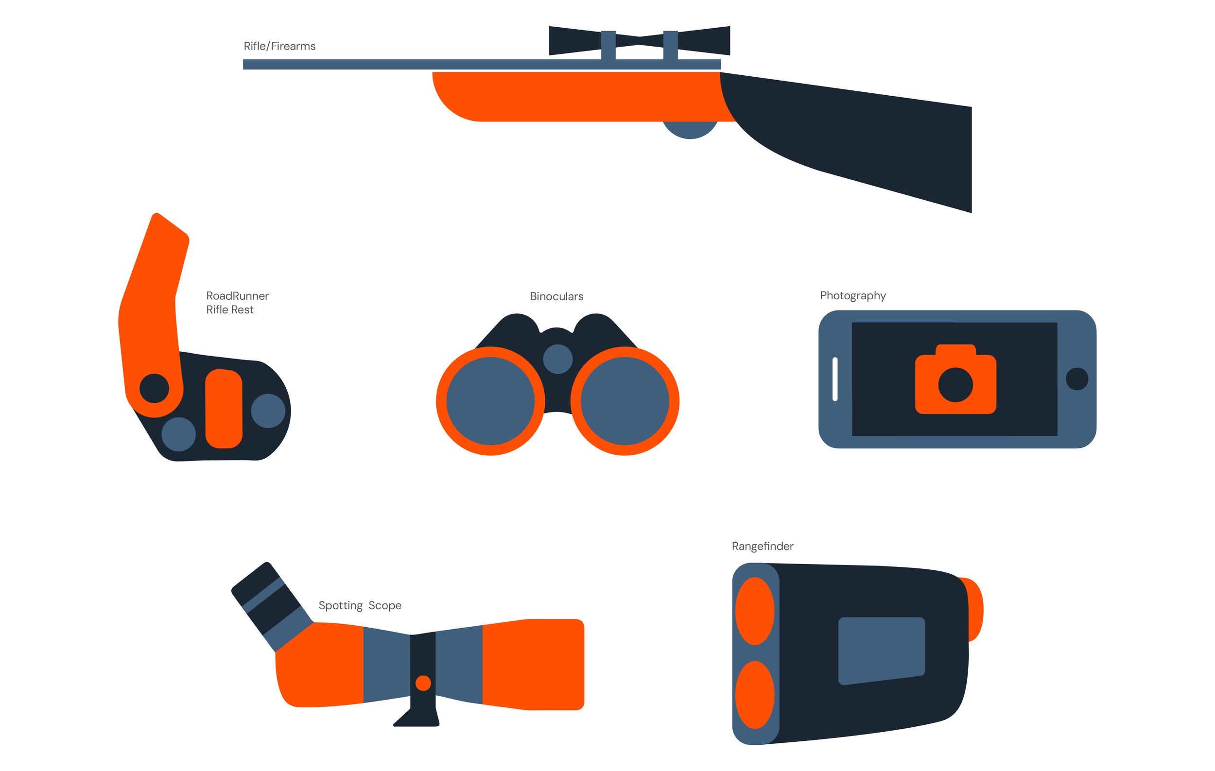
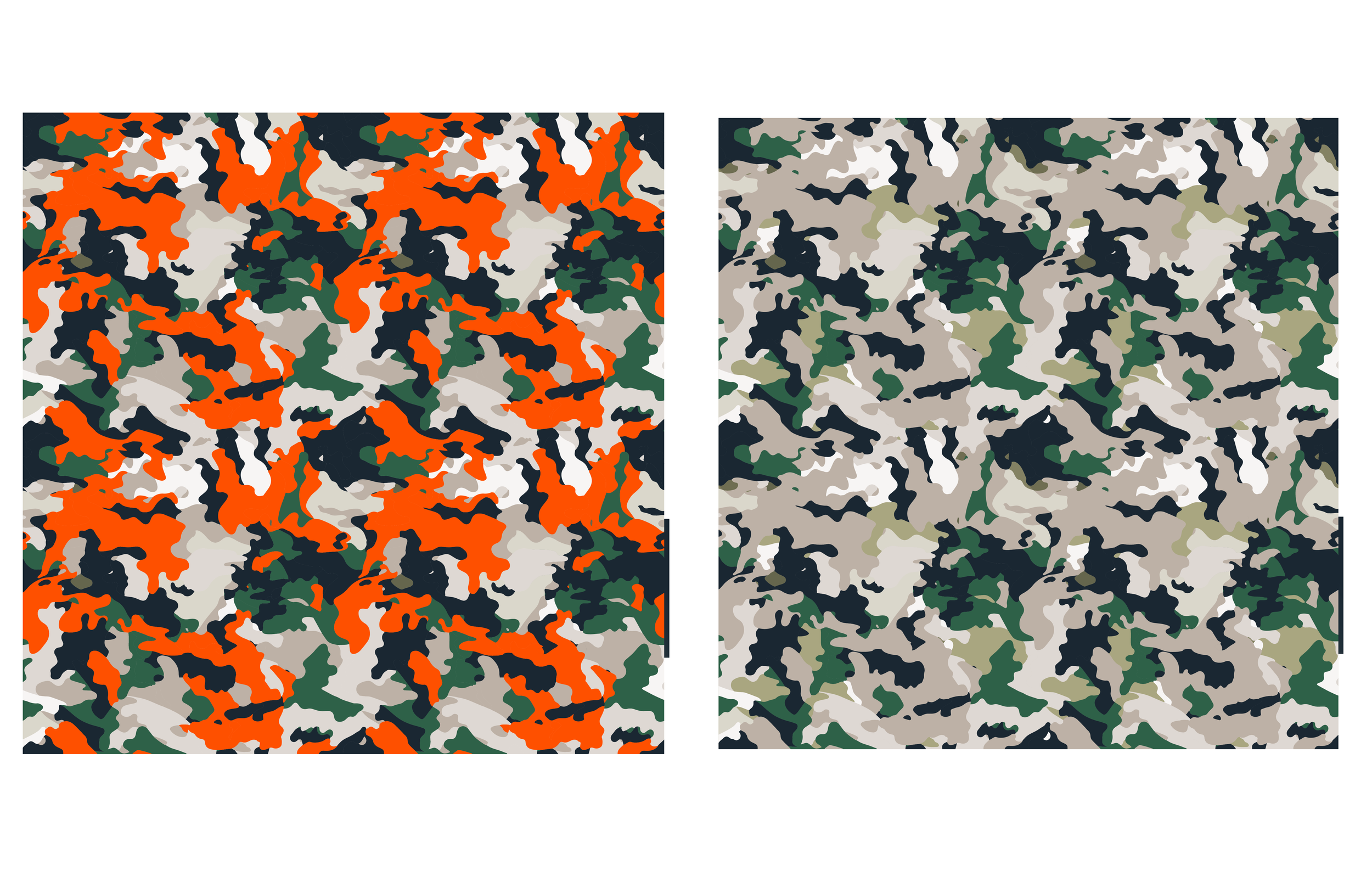
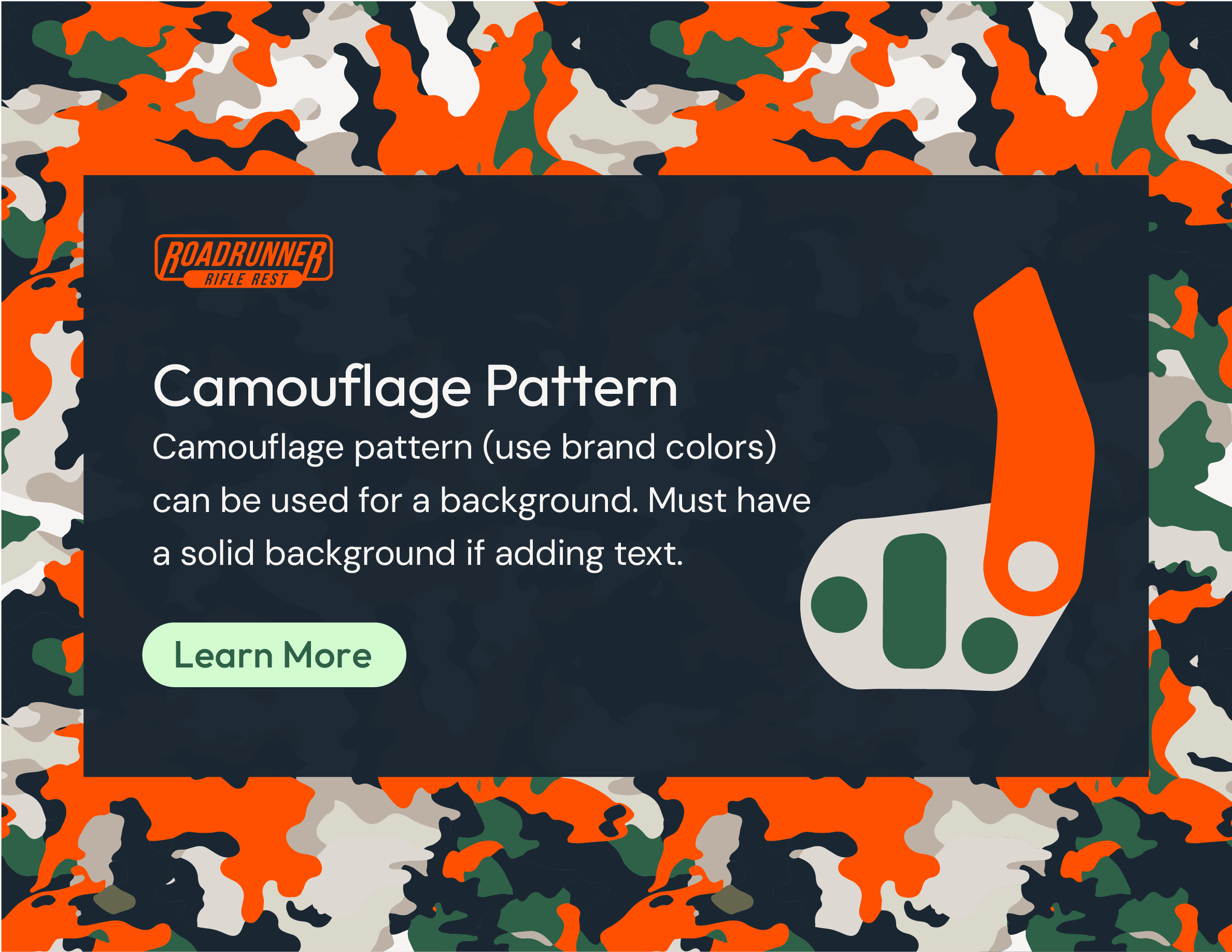
Pictograms and patterns
Built geometric pictograms and patterns to communicate key product functions with clarity and visual simplicity.

Brand guidelines
Created a concise brand guide to document the logo, color system, photography and typography for consistent future use.


Molded logo solution
Collaborated with the design engineer to mold the logo directly into the product for maximum durability and cost-efficient future rebranding.

Packaging
Developed a custom hang tag and refined the package structure to support clear technical illustrations and neatly organized components.

Selected digital printing on 24pt C2S and fine-tuned Pantone adjustments with the local printer to ensure accurate color across materials.


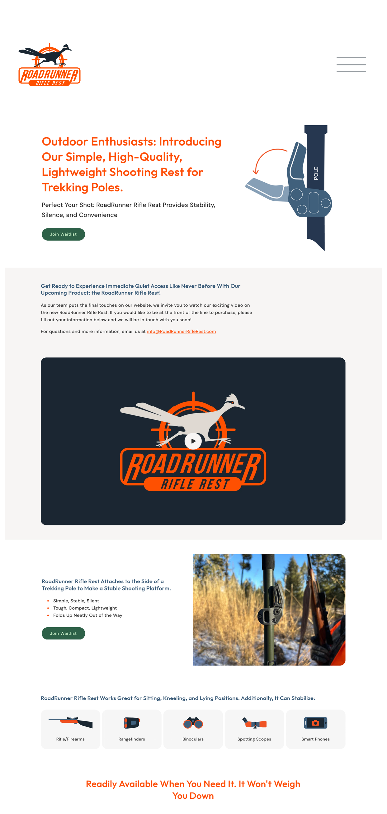
Website wireframe
Created a simple wireframe to guide the layout, content structure and integration of product video and photography.
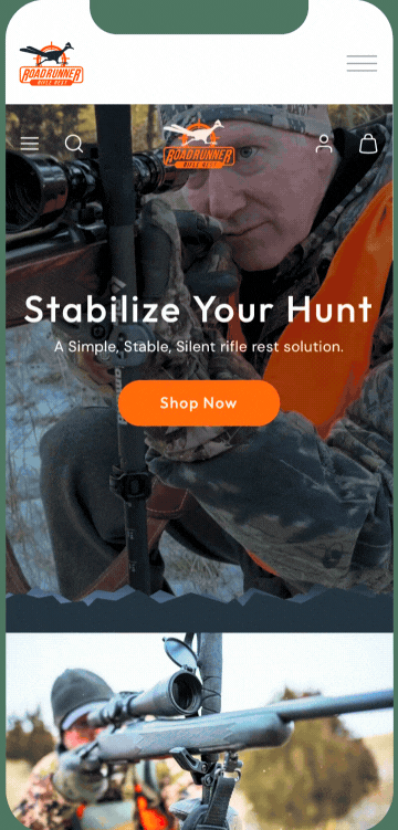
Existing website
Documented the current live site to show how the wireframe translated into the final build and evolved with the brand.
Wireframe pre-launch website
Pre-launch live website
Live website: https://roadrunnerriflerest.com/
Built for the Backcountry.
Made to Perform.